
Aesthetics of British roleplaying magazine covers
This year at the BDiGRA 2026 Annual Conference (University of South Wales, June 30th – July 1st), Nick Webber and I shared many 1970s/80s tabletop roleplaying magazine covers to road-test work in early stages.
This is another strand of our ongoing work about TTPRG magazines, shifting focus from letters selected for publication in the magazines to the covers themselves. Our research ties in with a special issue we’re co-editing of the journal Visual Culture in Britain, which will focus on British game aesthetics, and which some of the people here today are writing articles for. Our objective is to investigate and reflect on the idea that British TTRPG art, as articulated on the covers of these magazines, connects in some way with broader traditions of British fantasy art and illustration, and serves as a counterpoint, perhaps, to US TTRPG art in the same period. To prepare the presentation, we looked into how artists who were trained – or perhaps submersed – in a British artistic tradition helped to shape the aesthetic of fantasy games sold in the UK, and how these artists, and their understanding of their craft, represent a continuation of 19th century makerly ideas around art and design.
Across this corpus, we are looking at the work of 65 individual artists over 155 individual covers. Dominant amongst them are names you might recognise if you’re at all familiar with tabletop games from this period: the late Chris Achilléos and recently departed John Blanche, along with Alan Craddock, Ian McCaig, Les Edwards, and others. Only one of these covers was drawn by an artist with a recognisably female name, Polly Wilson, who did however have a number of credits for art inside the magazines – for example, illustrating several entries for White Dwarf’s Fiend Factory. Across the other 154 covers, we have 3 major contributors, each providing 8 or more covers, with the rest of the pool then offering 7 covers or fewer. Artists with multiple credits were typically providing art for White Dwarf and then for Imagine and/or Warlock as well; there’s only one case of crossover between White Dwarf and Adventurer, possibly because Adventurer is around pretty late in our period, at a point when White Dwarf is moving towards a focus solely on Games Workshop (with some possible artist exclusivity) but also perhaps due to geography, with Adventurer based in Merseyside, and White Dwarf in Nottingham, having officially moved there from London in the spring of 1986.
To focus on one example, John Blanche’s training and influence is instructive in how we are approaching this corpus. Blanche cited the pre-Raphaelites as a significant influence, as well as artists from Britain’s Golden Age of Illustration. Given most of these magazines emerge from a context where Blanche ultimately ended up calling the artistic shots, we feel this is worth some further investigation.
The Pre-Raphaelite Brotherhood was a group of painters, poets, and other artistic types in the latter half of the 19th century, who rejected elegant Classical styles in favour of capital-r Romantic ideas on nature, individual expression, and an interest in the medieval. Their work is characterised by bright colours, again, partly due to the movement’s resurrection of medieval egg tempera painting, where pigments are mixed with egg rather than with oil, and by dynamic and expressive figures. They were strongly linked to ideals of art and design education in Victorian Britain, notably so in the Midlands and Birmingham as well as elsewhere, and there’s a suggestion that the collection at Birmingham Museum and Art Gallery inspired Tolkien. The Brotherhood itself didn’t last more than a few years, but their influence persisted through the rest of the century.

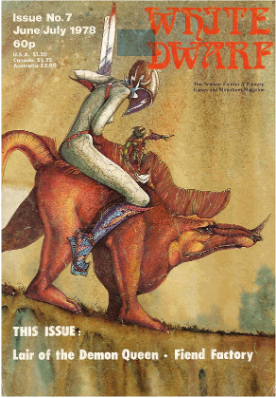
White Dwarf #7, drawn by John Blanche
Blanche spoke in interviews about how he was influenced by pre-Raphaelite artists, and particularly how he enjoyed the more expressive traces of the artist’s process visible on the canvases: “Those painterly brush strokes express raw emotion, whereas tight controlled painting is, to some extent, just purely a visual record. To put a bit of emotion into it gives the painting lots of warmth and a dynamic that you don’t get from photographic rendering.” Blanche’s colour choice is most evocative in connection with illustrators past, compared with the work of Arthur Rackham and Edmund Dulac, both key figures during the Golden Age of Illustration, which ran from roughly 1880-1930. As Blanche argued, their work is popular today, and it is evident how his illustration draws on some of these historical models, particularly the thinness of the characters, and the rather angular poses in some cases. Across the two sets of influences, then, Blanche is channelling a combination of 19th century high art and illustration work, to produce output that is firmly grounded in a British artistic tradition, and in ideas of artisanship and, rather notably, design and much as art.
The bit missing from Blanche’s style influences here is the spectacular aesthetics of punk, particularly second-wave punk. Here you can see his work described as gothic-punk by the Official Warhammer Art site, and as defining ‘Warhammer’s unmistakable grimdark aesthetic’; Blanche was extremely influential on fantasy art during the 1980s and onwards, in part due to his leading role at Games Workshop, where his art style defined Warhammer.
Grimdark, a genre of dystopian, amoral speculative fiction in which everything is overdone and the future offers no hope is generally considered to emerge from the British scene, and is usually understood as connected to Warhammer 40,000 (40K as it’s known), drawing its name from that game’s tagline: ‘In the grim darkness of the far future, there is only war’. The 40k rulebook was released in 1987; but grimness wasn’t a new thing for Games Workshop in 1987: the tagline for Warhammer Fantasy Roleplay, released the year previously, was ‘A grim world of perilous adventure’ – you’ll recognise John Sibbick’s cover from our earlier slide. Visually, Blanche’s style can already be seen to have developed many of the characteristics that continue into his Warhammer work.

White Dwarf #42, drawn by John Blanche
The decaying medievalesque streets on the cover of issue 42 of White Dwarf, for example – likely connected with Daniel Collerton’s ‘Irilian’ D&D scenario and city setting included in that issue – prefigure the crumbling medievalism of Warhammer’s Old World. Similarly, the fusion of punk aesthetics with Blanche’s older artistic influences that we see on the cover of issue 79 – published 4 months before Warhammer Fantasy Roleplay hit the market – evoke a style which was replicated repeatedly throughout Warhammer’s ongoing development – and you can see some of Blanche’s Warhammer art here to the right. With our corpus, this isn’t a track we can follow in great detail: 40k comes out in September 1987, our sample ends in April 1988, but I guess the point is the aesthetic was there already, and runs through Blanche (and others’) influences back into the gothic overtones of the Pre-Raphelites and Golden Age illustrators. Warhammer then sort of draws it out in more detail, and then people decide grimdark is a thing about 20 years later. But aesthetically, then, grimdark is a visual style influenced by core texts within British artistic and cultural production.

White Dwarf #79, drawn by John Blanche